The initial jewellery trend is a cool way to personalise your bling style. Varied shapes, bold lettering, Art Deco elements, diamonds and enamel accents take on an unexpected design approach.
At last week’s Super Bowl held in Tampa, Florida, National Youth Poet Laureate Amanda Gorman recited an original poem sporting NY-based jewellery brand Mateo’s Initial ring. “Amanda is an inspiration and the ideal Mateo woman: Intelligent, modern, strong and someone who aims to uplift and create a better world,” says Matthew Harris, founder of Mateo.
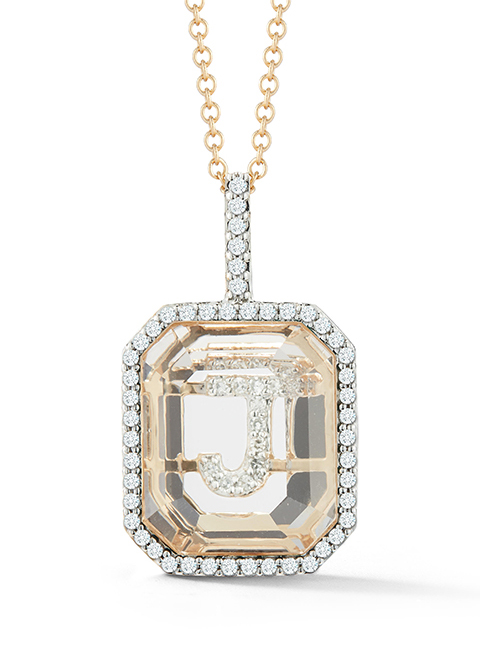
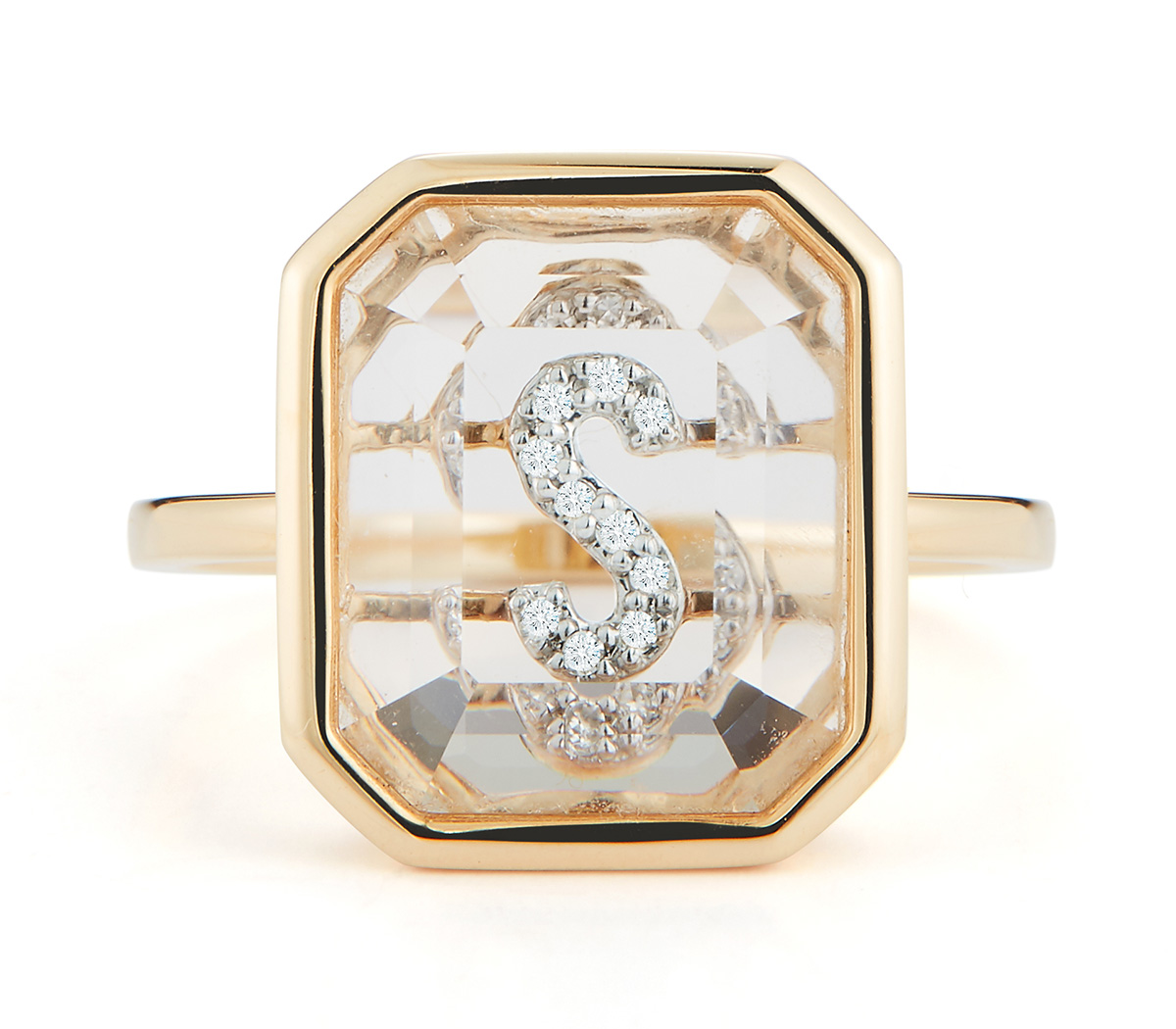
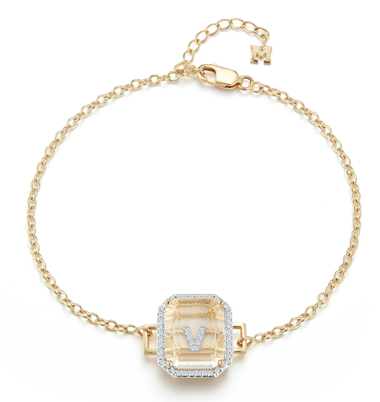
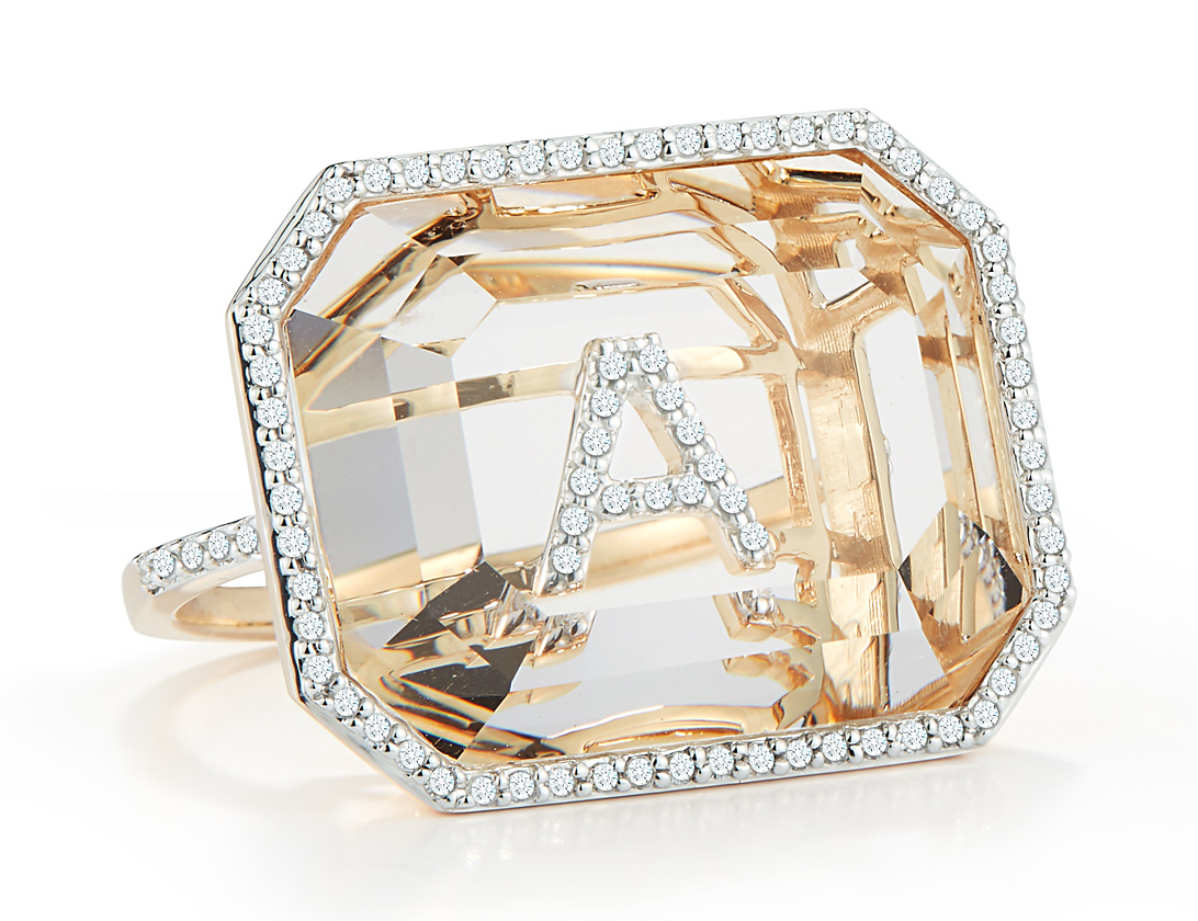
Mateo’s Initial collection
His new Initial collection was “a blessing from a mistake” made by his production team. The ring was initially designed to have an opaque stone, but it arrived on his desk with crystal quartz on top. “Once I saw our signature ‘M’ initial underneath, I designed to have the initial set with pavé diamonds and that was the birth of genius. It has been one of our most successful collections to date and a signature for the brand,” he says.
The secret initial series features a combination of gold, diamonds and signature emerald cut for the crystal quartz and draws on his vision for the perfect balance for a timeless piece.
Mateo says, “My goal is always to create personal jewellery.” His deep love for architecture shines through the pieces. “You can see a glimpse of that with the clean lines that runs through my work.” The line featuring rings, pendants and bracelets can be worn with any outfit and any occasion. “This collection currently has five pieces and will continue to grow. We recently added bracelets, which I absolutely adore,” adds the Jamaican designer, currently based in Houston.
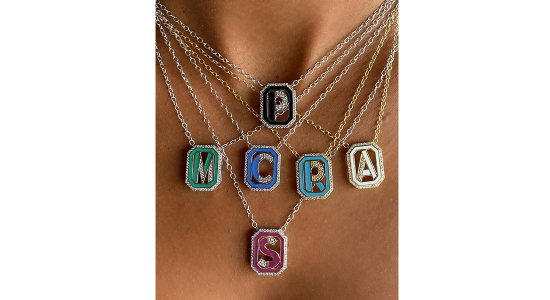
Colette Steckel toyed with the idea of creating personalised jewellery for a long time: pieces that looked “fresh and relevant,” while also channeling her signature aesthetics. For the Gatsby collection, Colette turned to diamond letters accented with enamels, an old favourite that figures across her works.
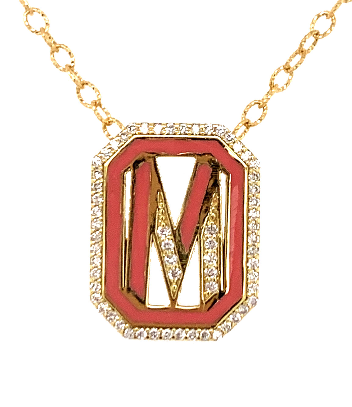
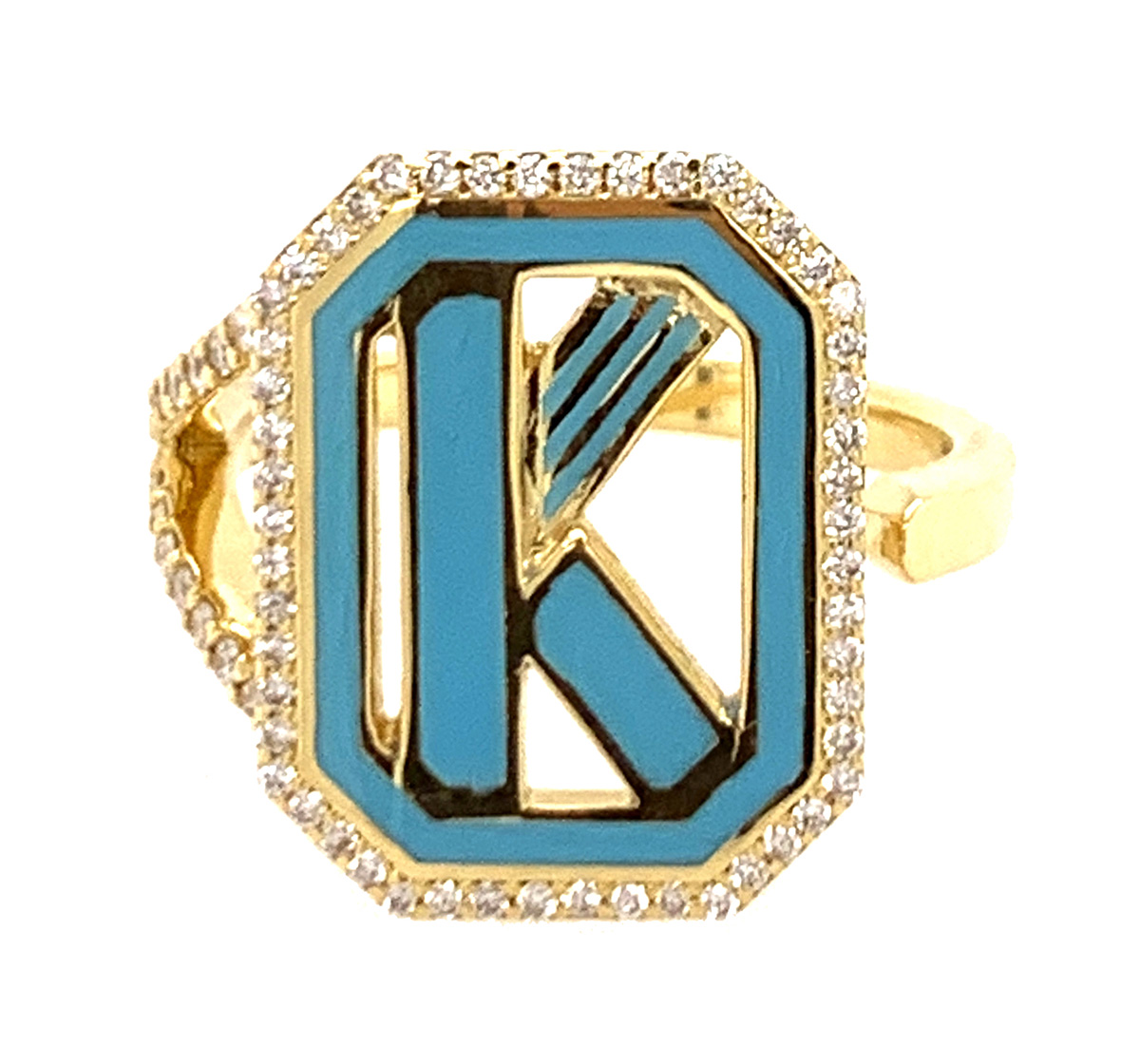
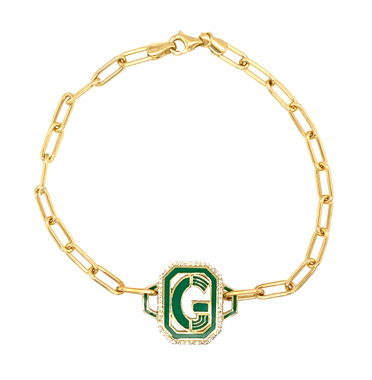
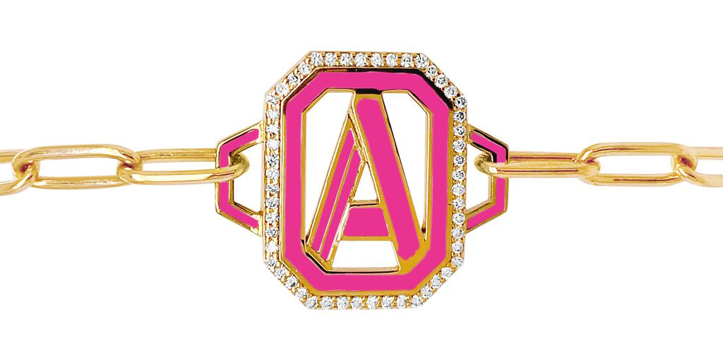
Colette Steckel’s Gatsby collection
As an ode to her home city, Paris, each initial in the Gatsby collection is enclosed in an elongated octagon that represents the shape of Place Vendôme. “It is one of the most iconic landmarks in Paris, built by Louis XIV as a symbol of power in the center of the city. Though I live here, Place Vendôme’s grandness never ceases to amaze me – its unique shape sparked the inspiration to encase the letters in a similar elongated octagon,” says Colette, who splits her time between Paris, Mexico City, and a newer home base of Los Angeles.
The Gatsby line draws on Art Deco vibes and resonates with the American glamour of the 1920s. Instead of the black and gold colour palette often associated with the era, Colette’s version relies on colourful enamel that imbue the rings, pendants and bracelets with a playful flair and a modern element of contrast. The letter jewels pop up both in a fine sprinkling of white diamonds and without the sparkly outline. The collection, crafted in yellow gold or white gold, is available in 15 colours – bubble gum pink, lavender, white, baby blue, royal blue, turquoise, emerald green, burgundy, neon pink, neon green, red, black, orange, purple and fuchsia. “It adds another layer of personalisation to the pieces – you can choose the initial and have it in your favourite colour,” she adds.